Tagged: tips
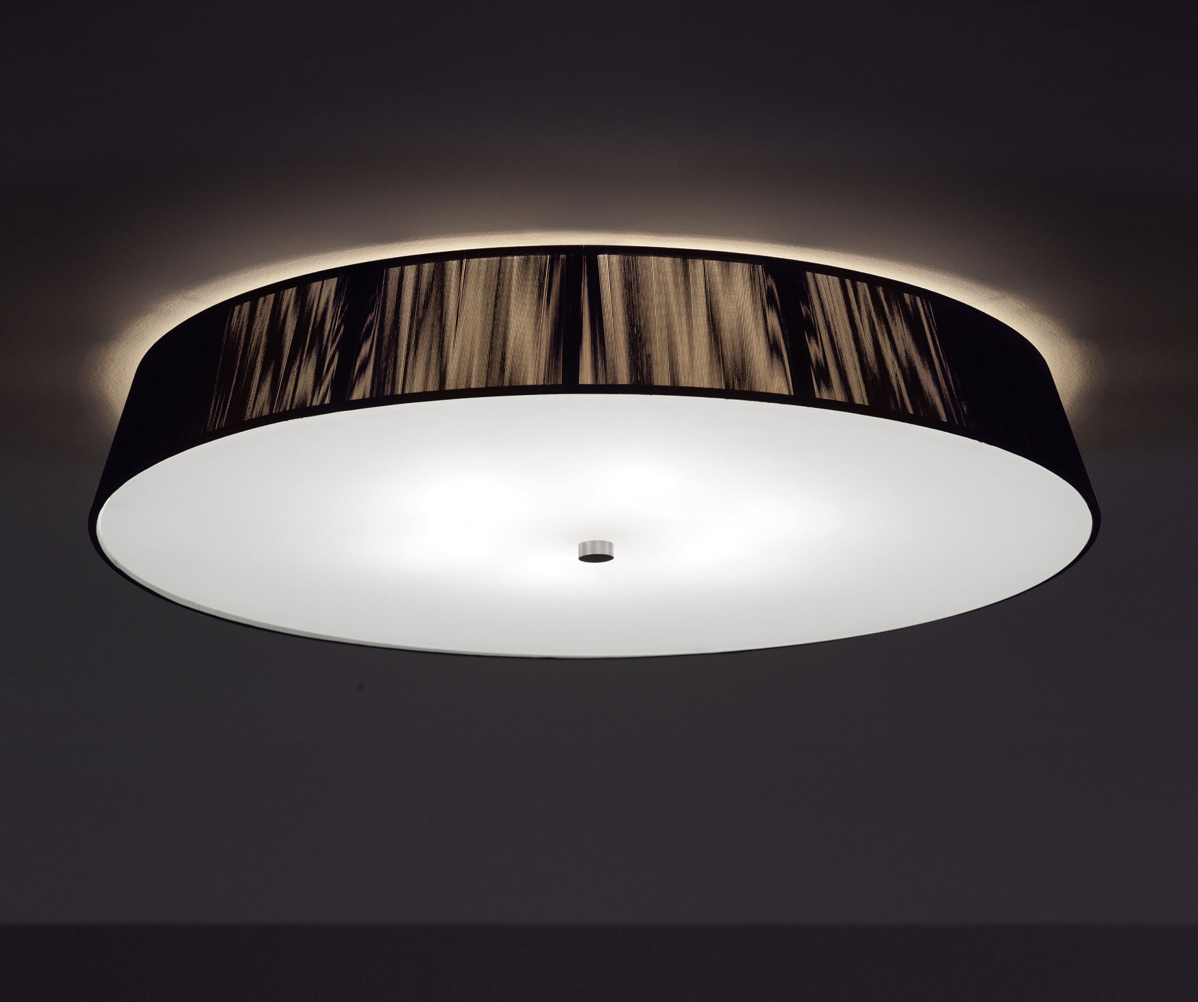
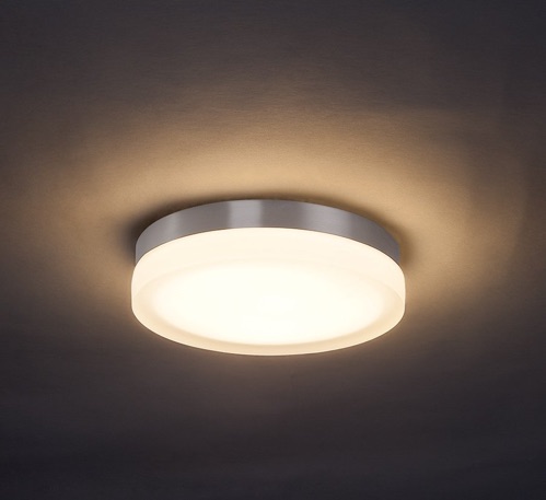
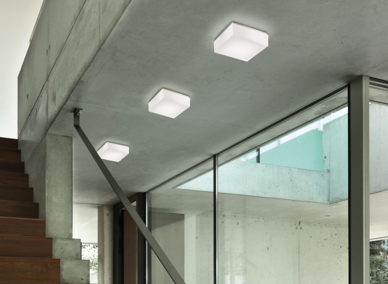
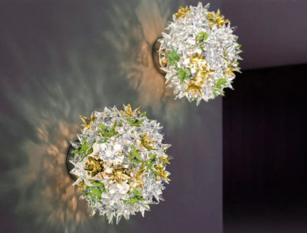
Inspiration: Flush Mounts
Today we are going to share some inspiration for you all in the form of flush mounts. Flush mounts may not seem like the most exciting form of lighting. Often pendants and suspension pieces acquire most of the attention. Flush mounted fixtures can also offer a wonderful aesthetic while not going overboard or blocking your line of sight. Take a look at some of our favorites:


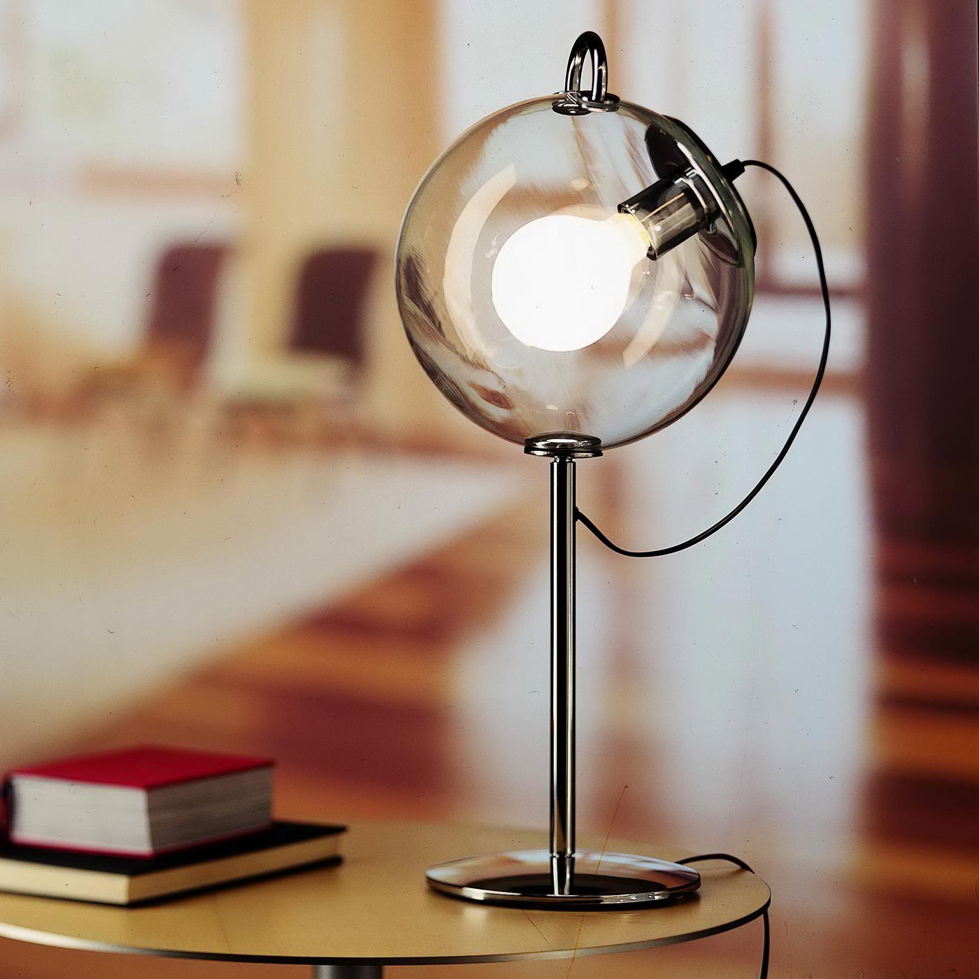
5 Last Minute Gifts From Switch
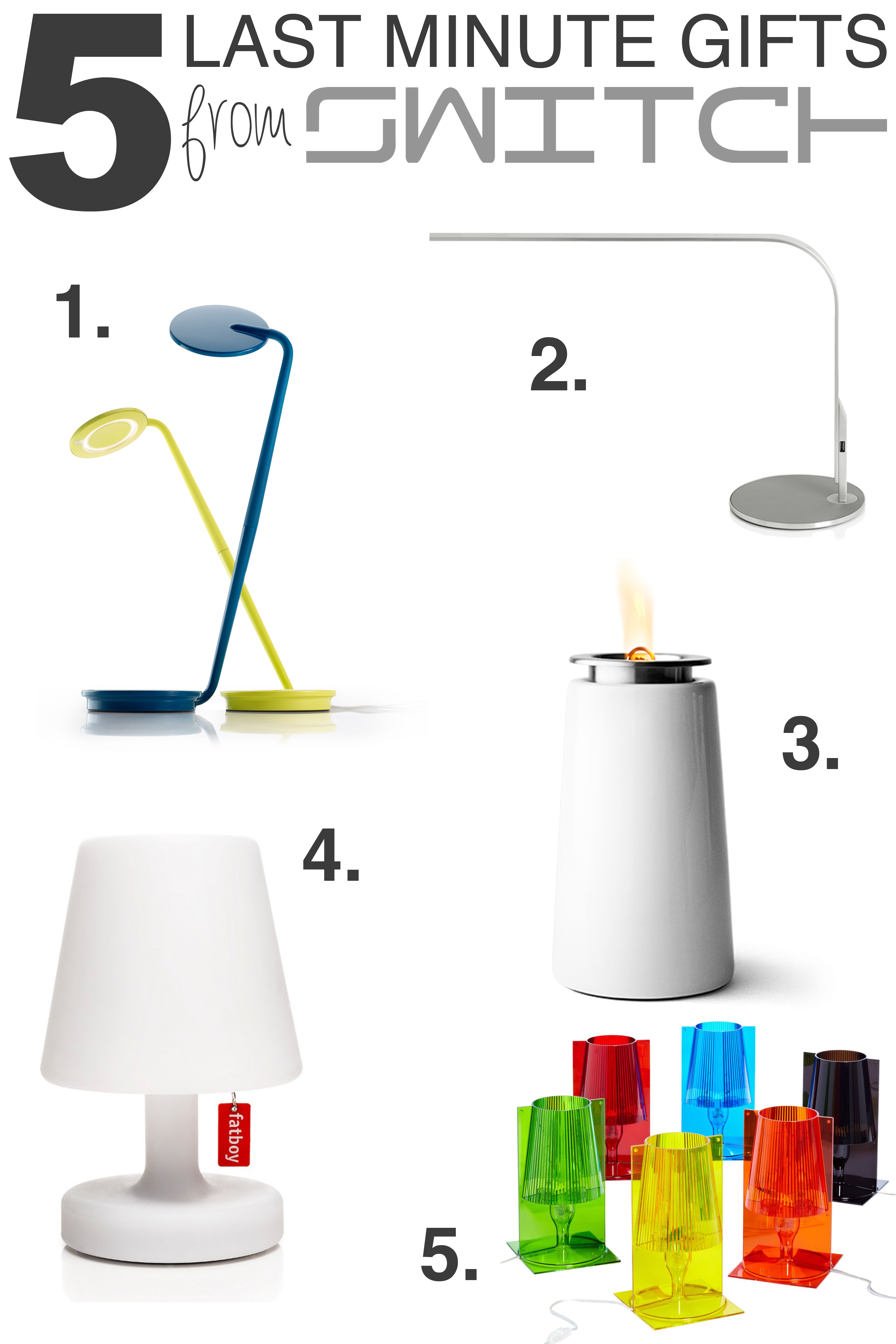
Still have a few gifts to figure our before the holidays? Check out these suggestions we have in stock, and ready to go home with you today!
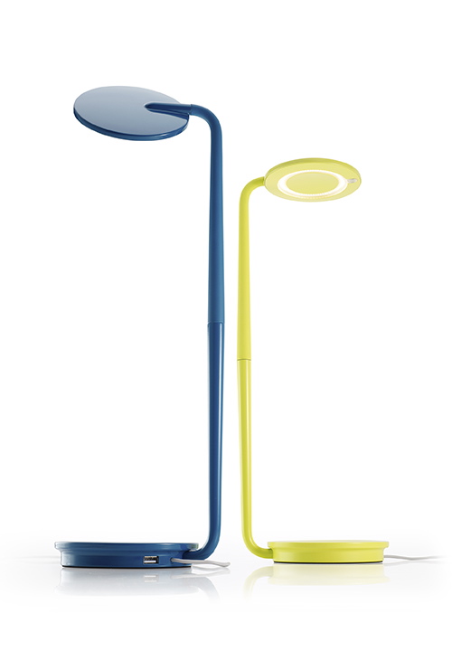
1.
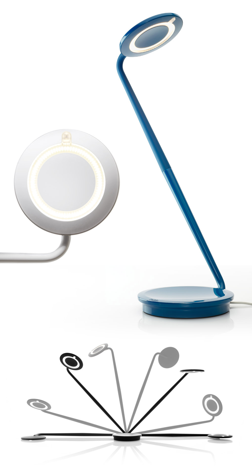
Our first suggestion is the Pablo Pixo. At only $199, this desk lamp is perfect for any students on your list. It has versatile maneuverability, and features a USB port, so you can even charge your phone or other devices from it!
2.
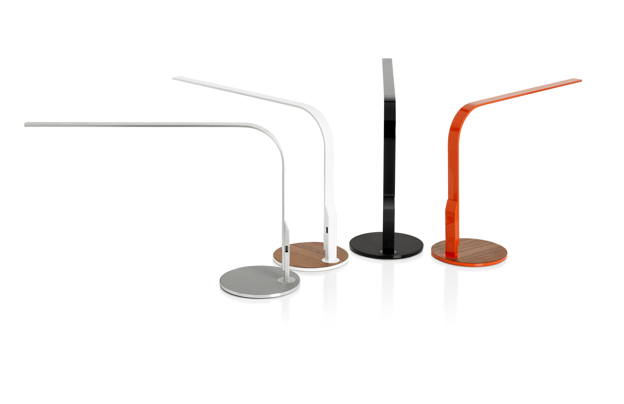
Number two is another wonderful lamp from Pablo. It’s the LIM360! LIM360 is able to turn a full 360 degrees, making it ideal for a workspace, and, like it’s little brother, it also boasts of a USB port. At $310 it’s sure to be a pleaser!
3.
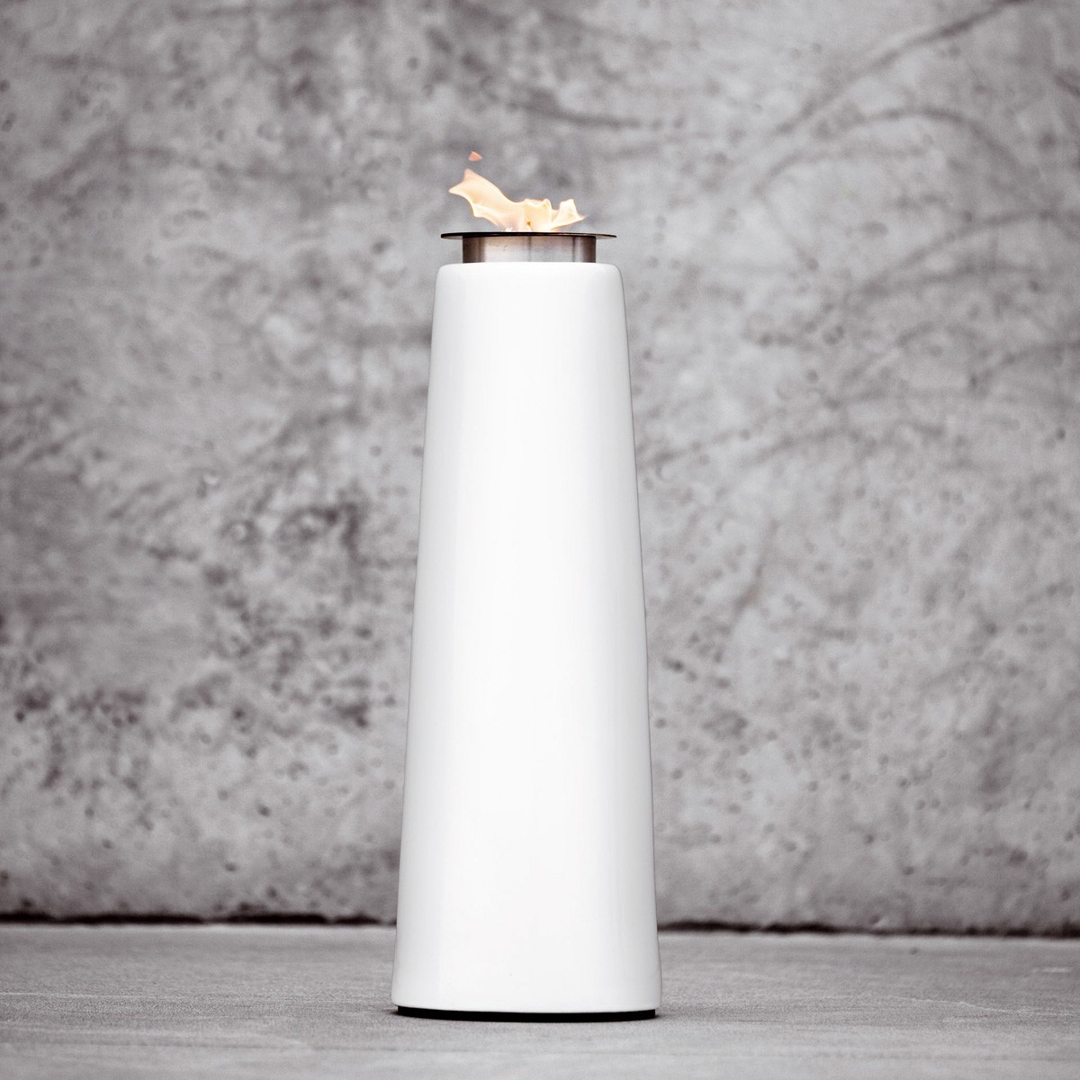
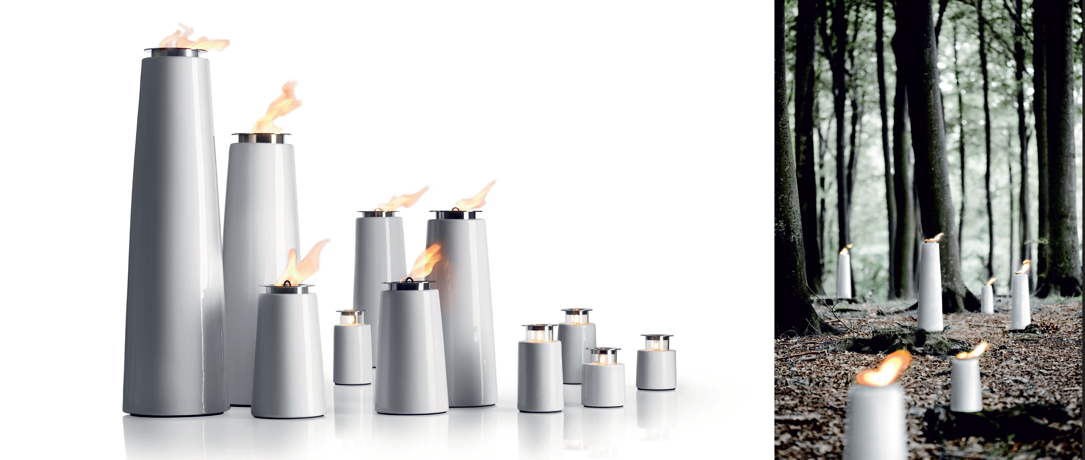
Number three on our list is the Lighthouse Oil Lamp by Menu. It’s perfect for anyone with outdoor spaces and comes in three different sizes! The best part is that it starts at only $90!
4.
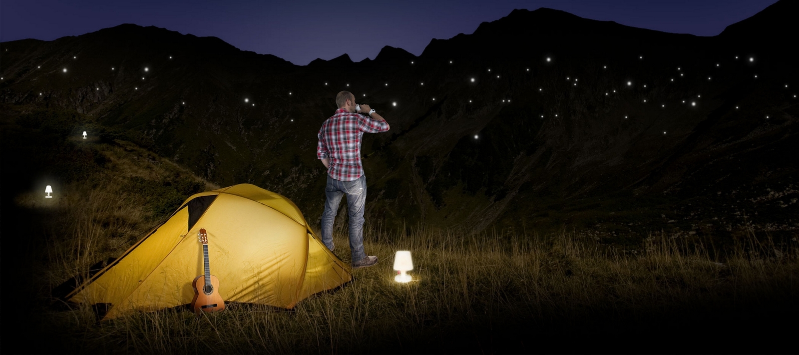
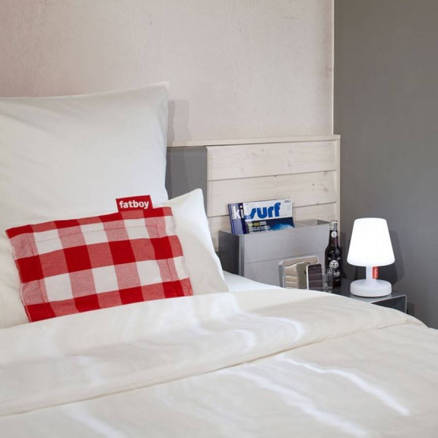
Fourth on our list is the magnificent Edison the Petit by Fatboy. This is a great gift for anyone who enjoys camping or the outdoors in general. The user is able to charge up Edison the Petit, then unplug him and take him anywhere! He will stay charged for a full 8 hours! Pick one up for only $89 at Switch!
5.
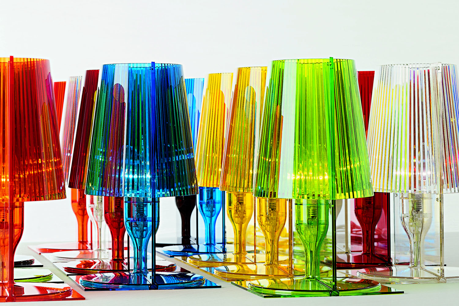

Last but no least, take a look at Take by Kartell. Take comes in a range of colors, and makes a perfect accent piece! Stop in and grab one for only $125 at Switch!
Tip: Choosing Color Temperature
Choosing a color temperature for your home is important. It can, however, be a confusing task. We’re here today to give you a few pointers and information that will make the decision an easy one!
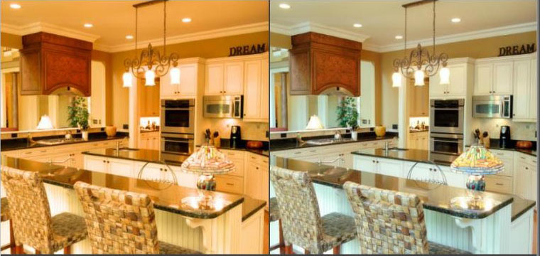
2700K (soft white) vs 5000K (daylight)
As you can see from the photo, the color temperature you choose can have a tremendous effect on your space! We rate the color temperature with the term “Kelvins”. Kelvins refers to how warm (yellow/ orangish) or cool (blue/ greenish) a light is. The higher the kelvins, the cooler the light.

For a long time, people pretty much always used a warm color temperature for their homes. Everyone liked how warm and cozy it made their spaces feel. This is perfectly fine for living spaces such as dens, dinning rooms, and living rooms, but for spaces you work and preform tasks in, a cooler temperature is more ideal. Let’s go through ideal temperatures for typical rooms in a home.

2700K– At 2700K, we get a “soft white”, which is slightly yellow. This makes a space feel warm and cozy, making it ideal for living rooms, bedrooms, and dinning rooms.
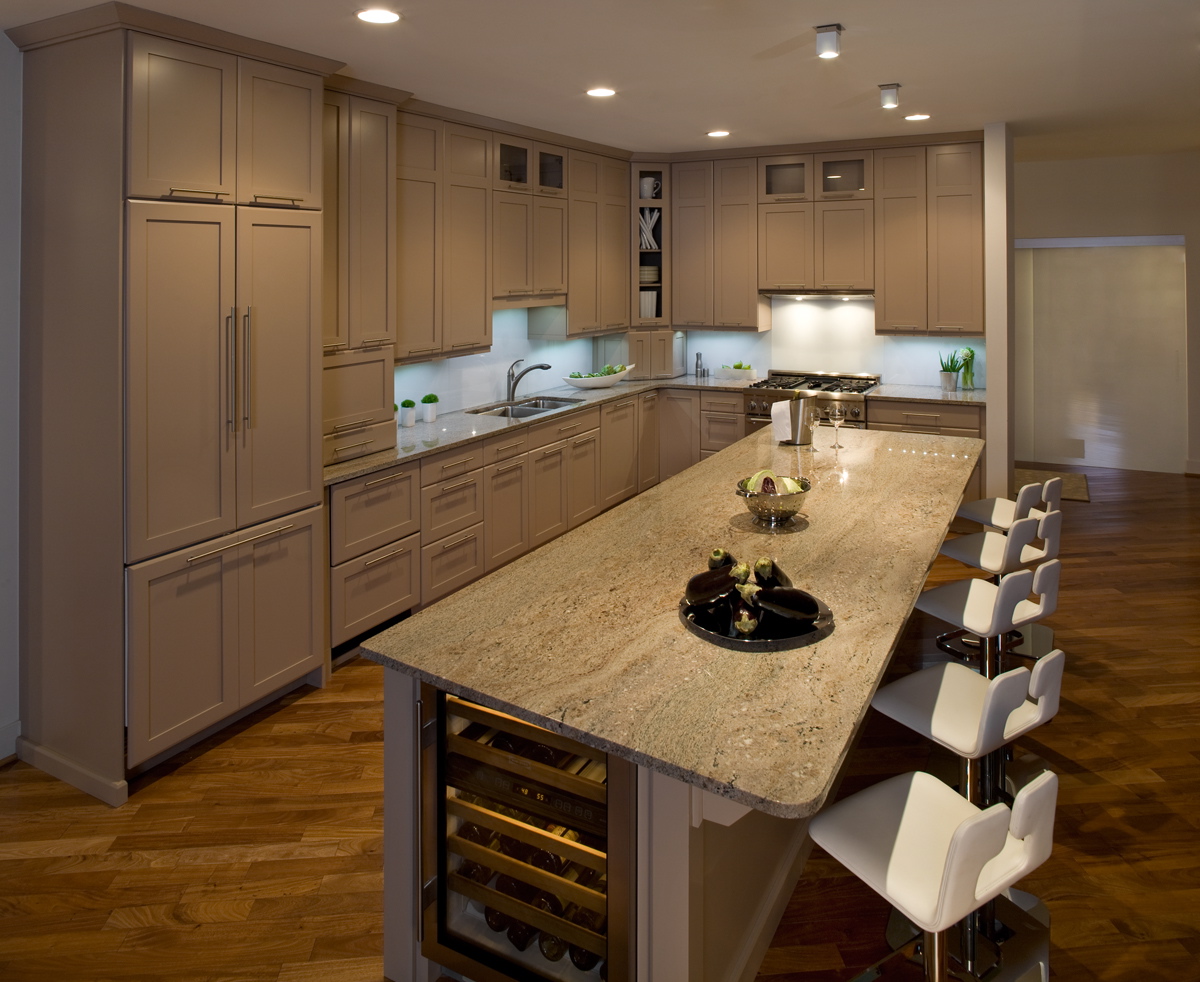
4001K– At 4001K, we get a “cool white”, which is a pretty true white. This makes it do well for spaces like kitchens, baths, and offices.
5000-6500K– Any color temperature between 5000K and 6500K is considered equivalent to daylight, spefically around noon on a cloudless day. It has a slightly blueish hue. Since this is the “truest” light, it is ideal for any space in which reading or complex activities (cooking, applying makeup, ect.) are preformed. This is because it offers the greatest color contrast.
We hope that this post was helpful to everyone, and that it will now be a simple task to choose a color temperature!
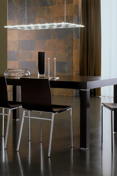
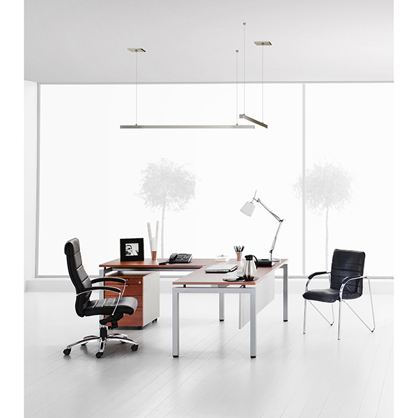
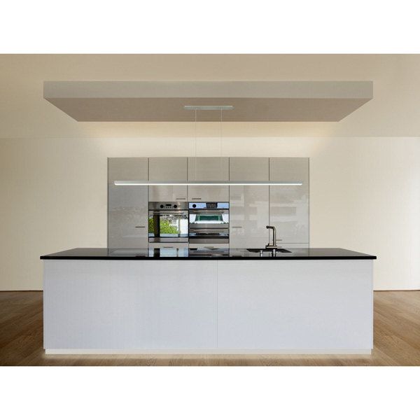
Tip: Pendant Hanging Height
When it comes to deciding what height to hang a pendant or suspension fixture, there are a few guidelines you can go by to make sure your new light is at the appropriate height. We’re going to go over a few different scenarios you may come across.
Over the Table
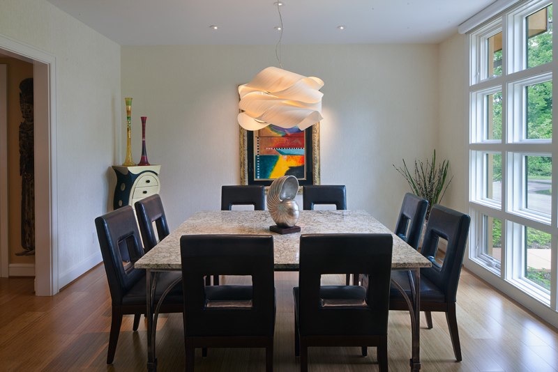
When hanging a fixture over a dining room table, you want the fixture to be low enough to provide enough light, but high enough to be out of your way and line of sight while you are at the table. Generally we suggest hanging it around 30″ from the surface of your table to the bottom of the light.
Over the Counter
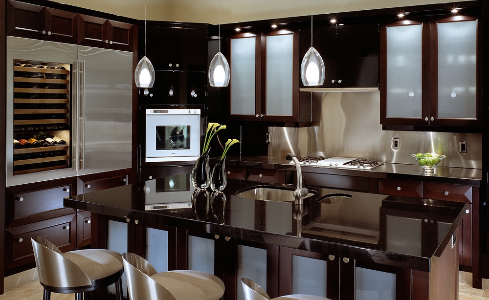
For fixtures over a counter, we suggest hanging them a bit higher than over a table. This is because we typically do a wider variety of things at a counter. You could either be standing or sitting. You want to make sure if someone is sitting at the counter, or standing to cook or clean, the fixtures are not obstructing their view. Hang pendants 30″-40″ from the surface of the counter to the bottom of the light. Your ceiling height can factor into where in that range you choose. With a higher ceiling, you should hang the pendants a little higher.
Not Over Anything (Foyer, Living Room, Ect.)
As a general rule, we wouldn’t suggest using a suspended fixture that isn’t over anything at all if your ceilings are not more than 8′, but all fixtures should be at least 60″ AFF (Above the Finished Floor). If your ceilings are higher than 11′, then we suggest adding an additional 3″ for every foot about 11.
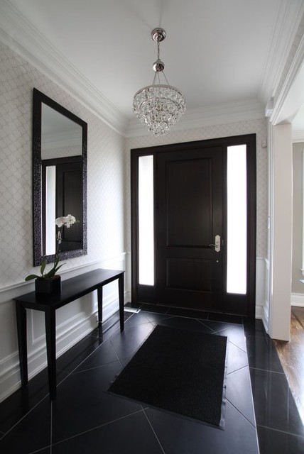
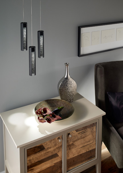
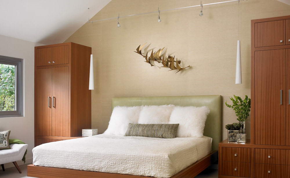
Inspiration: Using Pendants Instead of Sconces
Time to get inspired! Have you ever considered using pendants in places you would typically expect to see a wall sconce? It’s an interesting way to change things up and create a more unique space. Check out some of these examples!

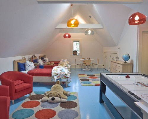
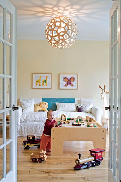
Inspiration: Kids Rooms
Today we’re sharing some fun ideas for lighting your kid’s rooms!
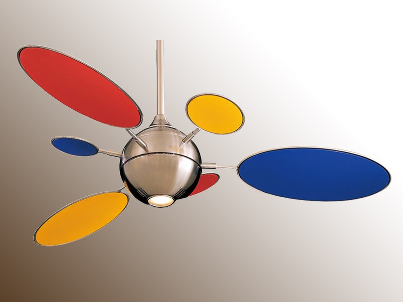
Use Color:
Kartell Fly
Minka Aire Cirque
Pable Pixo
Marset TamTam
Make a light Pattern:
David Trubridge Floral
Marset Maranga
Kartell Bloom
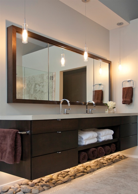
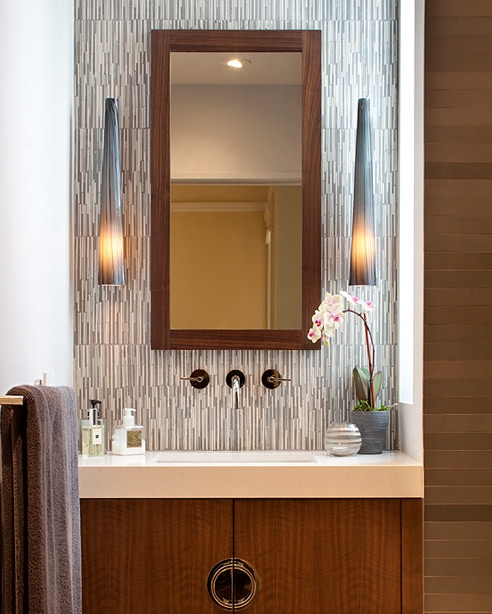
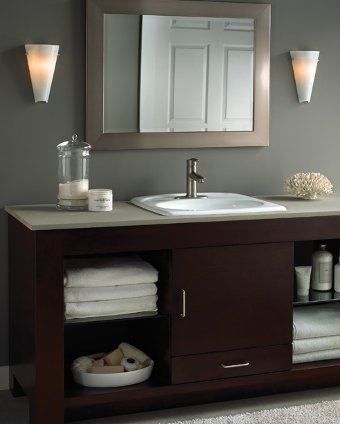
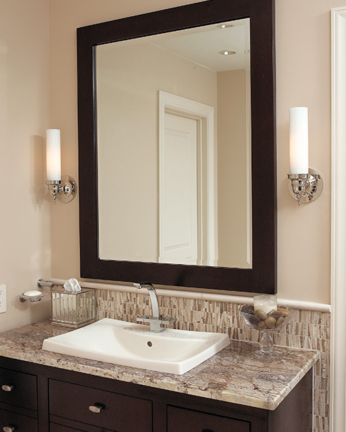
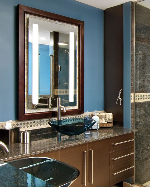
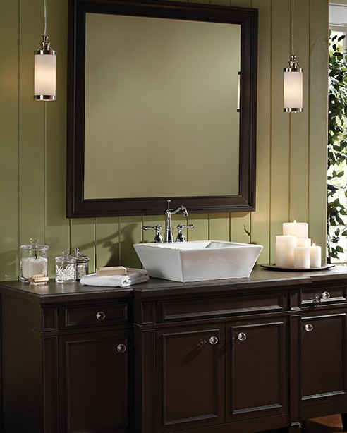
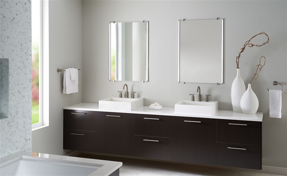
Tip: Proper Vanity Lighting
Proper vanity lighting is something that we feel a lot of people don’t thoroughly think about and understand. So many bathroom mirrors get adorned with a single fixture above it. While this is adequate for possibly a guest bath or commercial spaces, the space that is used to prepare ourselves for the day should not be lit in this manner.
A single light above the mirror is not ideal for applying make-up, shaving, or any of the other tasks that require good lighting on your face. When the light source is above you, it casts unwanted shadows on your face.
To achieve good lighting for your vanity space, there should be a fixture on both sides of the mirror. The fixtures should also have a decent diffuser to soften the light. This helps prevent glare and harsh light. With a light source on both sides of the face, you can be sure that your whole face is well lit without shadows!
Take a look at some examples. A few companies we carry even offer mirrors with built-in lights!

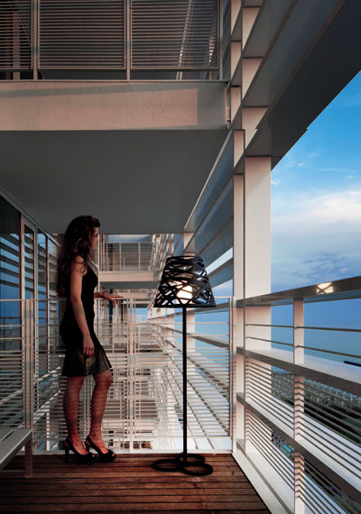
Inspiration: Lighting the Outdoors
Hello, Friends!
Today we are sharing some inspiration for lighting your outdoor space! If you’re thinking of getting some lighting for outside, but aren’t sure what you want, take a look at some of these photos and get some ideas!
Tornado by Studio Italia Design
Santoniri by Marset
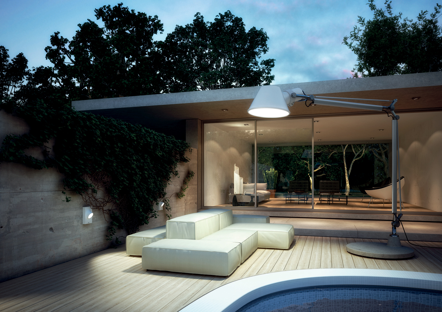
Tolemeo XXL by Artemide

Magnolia by Tango
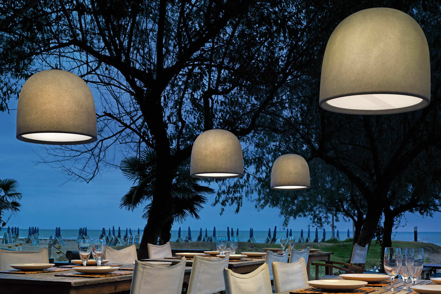
Campanone by Modoluce
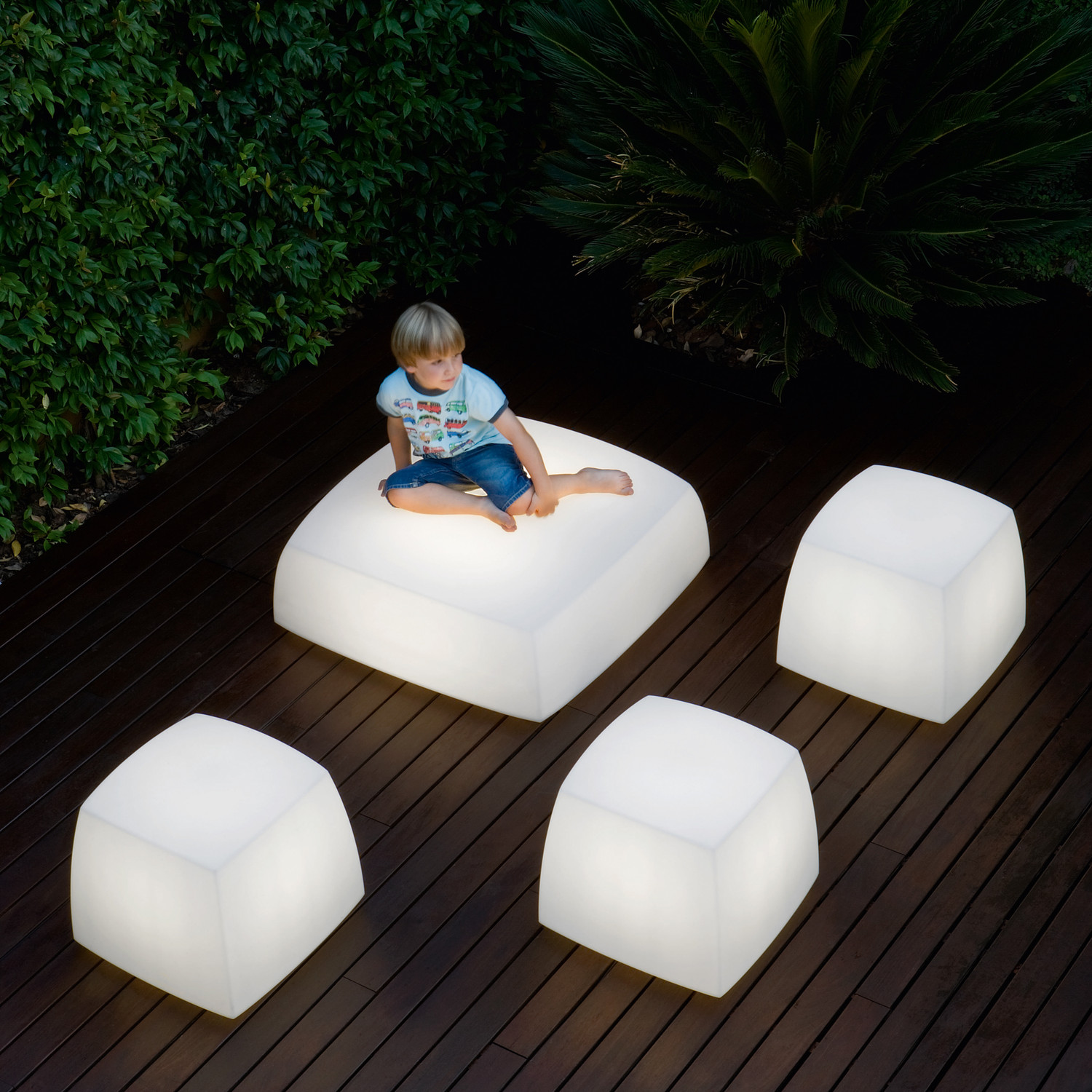
Lite Cube Box by Tango
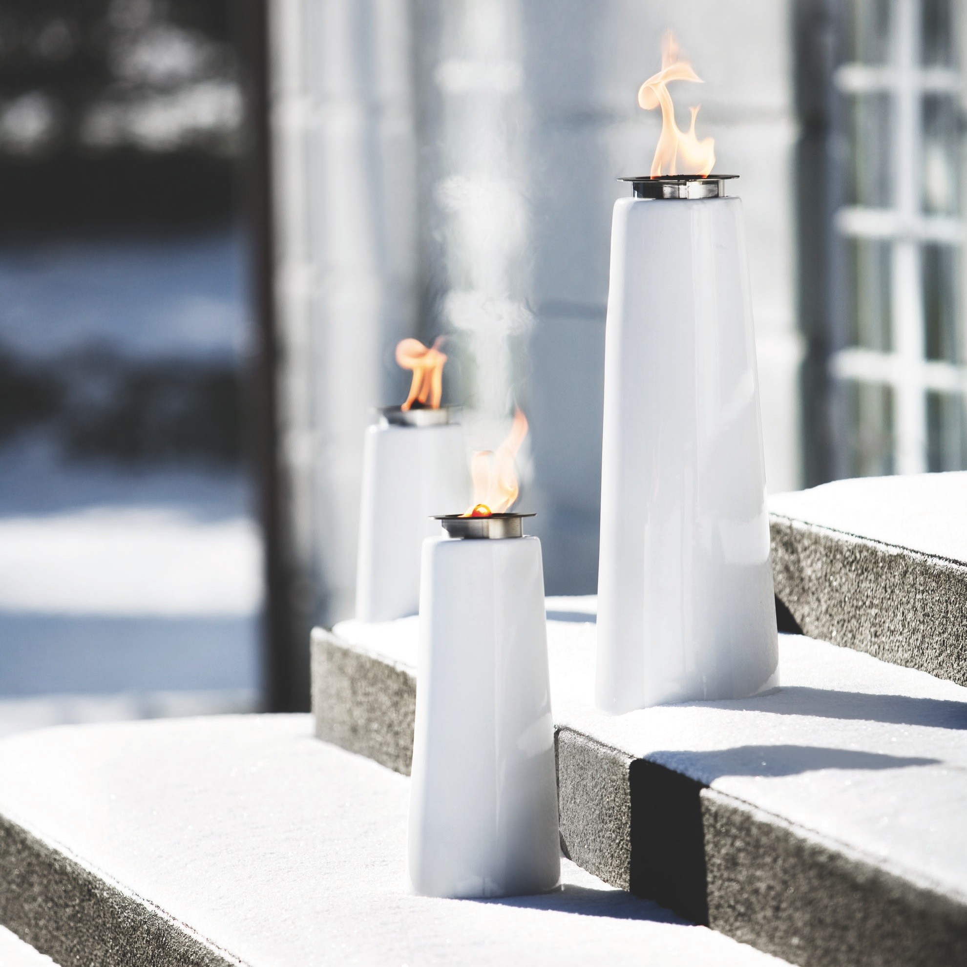
Lighthouse Oil Lamp
Tip: Using Layered Lighting
If there is one thing that all lighting designers agree on, it is that the key to good lighting is the use of layered lighting. Using layers of light not only allows for maximum functionality and flexibility out of a space, but can also be used to create a variety of moods.
There are three layers that should be considered and included in every lighting design: general (or ambient) lighting, task lighting, and accent lighting.
General Lighting
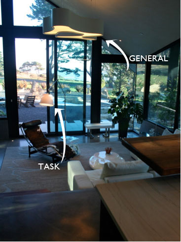
General lighting is typically the first layer to take into consideration. It consists of ceiling mounts, down lights, pendants, and cove lighting (like above cabinet lighting). General lighting is used to uniformly light a space, and tends to be a soft light.
Task Lighting
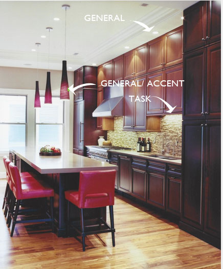
Task lighting is used to provide extra light needed to perform specific activities. Examples of task lighting may be a desk lamp a student uses for homework, or under cabinet lighting that helps you see when chopping vegetables! These usually consist of table and floor lamps.
Accent Lighting

Accent lighting is used to draw attention to something using a brighter contrast. In a lot of cases, it is used to highlight artwork or architectural details. A lot of accent lighting is usually used in landscape architecture to highlight a specific tree or textured wall. These usually consist of track lighting, down lights, and decorative lamps.
Dimming and controls:
A good thing to consider when using layered lighting is the controls. It is especially helpful to have each layer on separate switching and dimming. This allows for the widest variety of moods and functions available to the user!
Still have some questions about using layered lighting? Come in or schedule a consultation with us! We’d love to answer any questions!
The Disapearing Act: Using Minimal Lighting
Not all fantastic lighting needs to be the center of attention. Sometimes the fact that it’s not the center of attention is part of what makes it so fantastic. Maybe you have a wonderful view or a great architectural space, and you don’t want to draw attention away from those details.
Here are some of our favorite products that seem to ‘disappear’ into their surroundings. They don’t draw your eye away from the rest of the space, but they do add a subtle design element that will enhance it.
Fairy by Leucos
Sospesa by Fabbain

Cirrus Float by Edge Lighting
Minconos by Artemide